
4 Colour Trends For 2022
-
- January 3, 2022
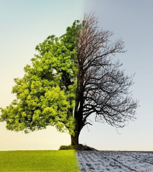
As the fireworks fill the sky with thousands of bright, sparkling colours and our homes come alive with the arrival of a brand new year, first, you need to unlearn -or at least reevaluate- what 2021 interior colour trends are and get acquainted with the new colours for the year 2022.
Many summer hues had a prominent place in interior design last year. Particularly, warm shades such as white, grey, and beige were some of the popular colours explored throughout the year as they developed, blossomed, and faded. Though calming neutral hues are still present, an array of other colours have stepped up to the plate, and that’s what we’ll be discussing today. Here, you’ll discover what they are, as well as how you could incorporate them into your home.
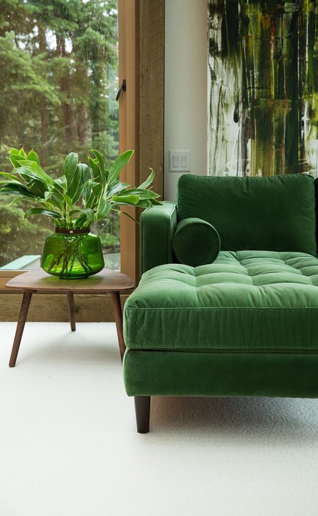
Garden Green
Essential Home
Our natural world has often been our refuge during the pandemic, which is reflected by this soft shade. The lockdown provided us with a great opportunity to connect with our gardens and fall back in love with nature. Whether artfully illustrated or real, this shade complements plants and can promote a sense of well-being in the home. Because of its calming nature, choose artwork that speaks to your well-being when coupled with this shade.
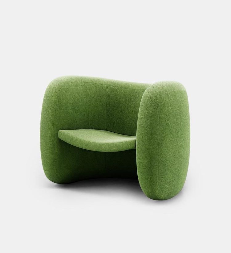
Lagoa Armchair ZANINI DE ZANINEjpeg
Warm Sky Blue
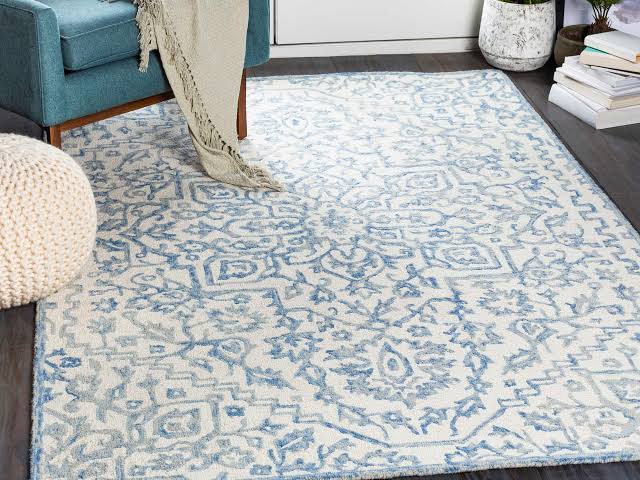
Kayseri Light Blue Hand-Tufted Rug COTTAGE AND BUNGALOW
Effortlessly bright and cheerful, this fresh shade can breathe new life into any room. It is uplifting, calming, and familiar, but also suitable for creating an inviting, restful haven. There may be a shift toward colour in the future with less emphasis on neutrals, so this shade is likely to be the new grey.
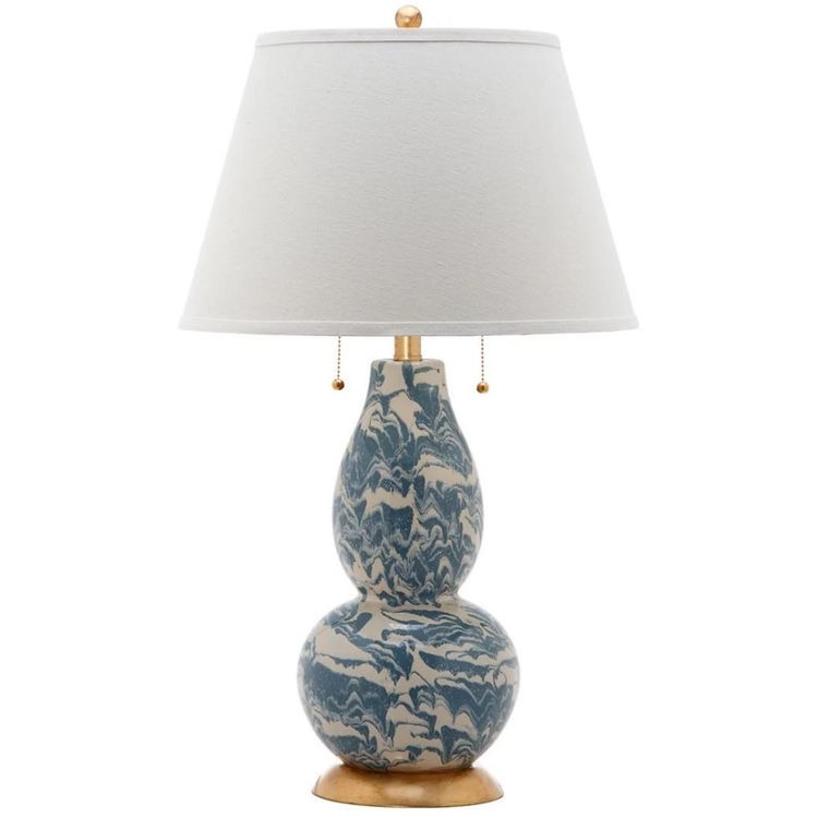
Marbleised Blue Lamp
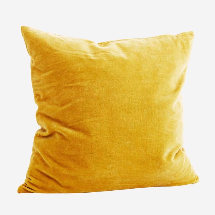
Sunny Yellow (Babouche)
-

- Square Velvet Cotton Cushion
-

- Armchair ARACELI
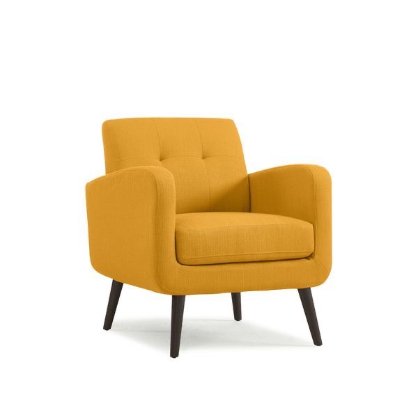
As the year 2022 approaches, we will appreciate vibrant colours that herald a return to normal. Its timidly bright and uncomplicated vibe is perfect for embracing this trend – bold, but not overbearing.
Although it has a bold yellow tint, it’s not overly bright or overpowering, which makes it perfect for a larger room, whose cheerfulness will be amplified by its thickness. When it comes to the colour wheel, this buttery yellow would pair well with a pale blue or soft pink.
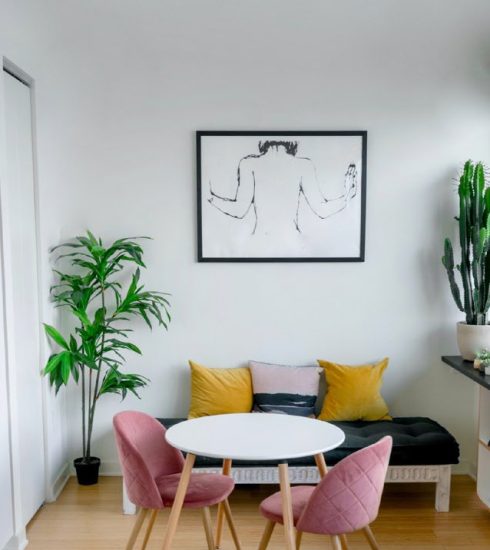
Off-White
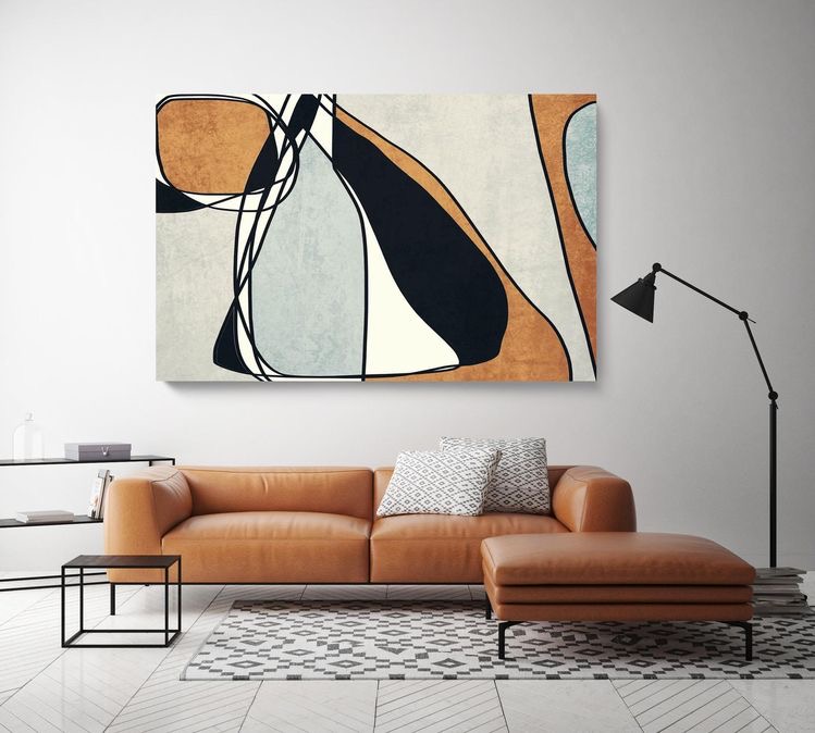
Modern Art on Off-White
With its grounded, unassuming tone, this shade matches easily with nearly any other colour. The shade of white in this room is muted, timeless, and comfortingly familiar. It is the perfect backdrop for large-scale artwork or statement rugs, as well as for displaying dramatic, eye-catching objects.
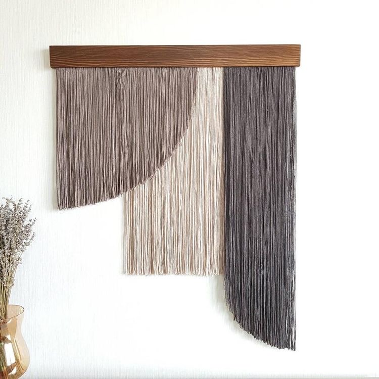
Large Fiber Textile Art